

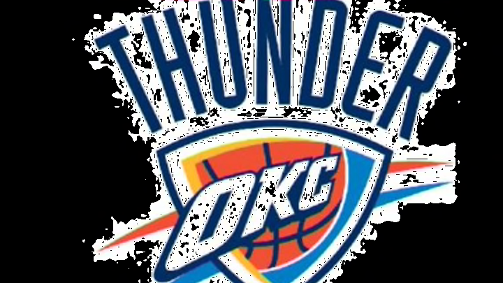
The Oklahoma City Thunder have the worst logo in the NBA. Well, according to Grantland’s Zach Lowe they do. While it’s only one man’s opinion and as he points out, these things are always subjective, it’s a sentiment I’ve heard echoed in the past.
Even the hardest of hardcore fans would agree, the Thunder logo doesn’t have the same appeal as the iconic logos of the Bulls, Lakers and Celtics do.
ALSO ON HOOPSHABIT: 25 Best Players To Play For The Thunder
But the worst in the league?
Surely it’s not as bad as this …

More from Oklahoma City Thunder
- 3 Steps for Shai Gilgeous-Alexander to enter the MVP race next season
- 5 NBA teams on the rise that will surprise everyone in 2023-24
- 5 players who will challenge Victor Wembanyama for Rookie of the Year
- What does Oklahoma City plan to do with an abundance of picks?
- Thunder Summer League: Notes from Holmgren’s chaotic yet magical play
No, it isn’t but that doesn’t mean it can’t be improved.
So What isn’t Good About It?
Besides the word written above the shield, the logo doesn’t look very Thunderous. Apparently we’re meant to think of storms and bison when we hear the name but neither are present. While the triangle shaped-shield looks cool, there isn’t anything relevant inside of it.
I’m glad they haven’t featured a Bison, that just doesn’t feel right to me, however it would be nice to see something other than a boring basketball inside of the shield.
What Works Well And What Could Be Better?

FanSided
I’m not claiming to be an expert in the design field but I know what I like. And as mentioned earlier, I think the shield works well. So does incorporating OKC into the logo but the highlight for me are the colors. You can’t go wrong with blue, white and orange, it just works.
While it isn’t perfect, there’s certainly a lot to like about it – there is for me anyway. And with some minor tweaking it could become a lot better. Adding a thunderbolt into the logo somewhere, preferably inside the shield replacing the basketball would be a welcome addition.
Even if the logo were to stay the same, it wouldn’t be the end of the world, yet as stated in Zach Lowe’s piece the Thunder are open to making some minor changes.
As long as they stay away from the bison, that’s cool with me.
What do you guys think?
Next: NBA Finals History: Ranking The Last 50 Champions
More from Hoops Habit
- The 5 most dominant NBA players who never won a championship
- 7 Players the Miami Heat might replace Herro with by the trade deadline
- Meet Cooper Flagg: The best American prospect since LeBron James
- Are the Miami Heat laying the groundwork for their next super team?
- Sophomore Jump: 5 second-year NBA players bound to breakout