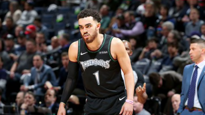
3. 2018-present Earned Edition jersey
After the lukewarm reaction to the original plain grey City jerseys, the Timberwolves knew that they needed to update the design that was supposed to represent the state, and they needed to do it quickly. That pressure led to the Wolves designing the Prince-inspired “Purple Reign” jerseys, which found huge success among the fanbase.
With the popularity of the Prince jerseys, Minnesota hoped to ride that wave when they announced that the team would be wearing the new “Earned Edition” jerseys on a Dec. 28 game against the Atlanta Hawks. Normally, trying to ride the popularity of one design by just introducing a toned down design would fail miserably, but this time was different.
The electric purple that lines the jersey adds just enough color to keep the design interesting, and the color blend is easy on the eyes. Much like the 1996-08 update, the new typography also goes a long way towards the purple lightning aesthetic, and the white background makes the color look even brighter than it is.
As with any jersey design, there are some flaws in it. First, much like the Association jerseys, these are almost entirely white, which could get boring. Also, in all honesty, the jersey just feels like a negative version of the new City Edition jerseys, and if only one of those two designs are going to last then it will almost certainly be the City Edition.
