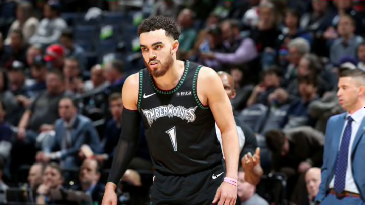
Minnesota Timberwolves: 5 best jersey designs in franchise history
By Ethan Becker

5. 1989-96 away jersey
This is the original look of the Minnesota Timberwolves. Admittedly, this entry is graded on a slight curve, since most jerseys from around this time weren’t very interesting (and no, I’m not counting the Houston Rockets. Those were awesome).
Still, there’s something about these jerseys that just seems so cool. The deep blue and light green really work well together, and the thick, white trim works to tie everything together nicely. Plus, the Timberwolves logo at the time is one of the best from that era (again, not including the Rockets).
There are some things working against this design though. For starters, it’s fairly simple. There’s no cool, interesting pattern to follow, and just like the current jerseys, there doesn’t seem to be much actually representing Minnesota on them. Another problem is the green. While it does go nicely with that blue, it can be a bit of an eyesore, and when the Timberwolves upgraded their jerseys in 1996, well…