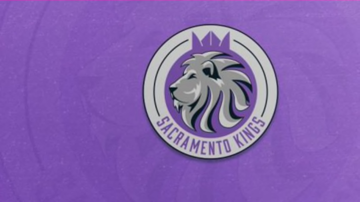
An NBA logo is extremely important. Heck, all of their branding is important but the logo and color scheme are discussed, debated and worked on tirelessly in an effort to have something that immediately stands out. Teams like the Los Angeles Lakers have their famous purple and gold, while a team like the Chicago Bulls have their famous bull that is immediately associated with the franchise.
Graphic designer Addison Foote recently took on a project where he redesigned all 30 NBA logos. I’ve cherry picked my five favorites to show to you here (you’ll have to go to Addison’s piece itself to see the rest).
SACRAMENTO KINGS (seen above)
There’s no question that this one is my favorite. The logo is clean and would fit well on any apparel, I can’t get enough of the lion and the crown is a great touch. King of the jungle meets the kings of the court (not according to Shaq — or the last decade, but I digress).
MEMPHIS GRIZZLIES
There’s just something about a ferocious logo for me. It’s like the anti-Pelicans. On top of that, I’ve always been a fan of the baby blue primary color.

ATLANTA HAWKS
This one combines a lot of key elements for a logo. You’ve got a nod to history (the bird), there’s no question what sport this is for (the ball) and the author even threw an “A” and “H” in the logo to represent the city and team name.

DETROIT PISTONS
Sometimes a logo isn’t given an easy route to take, because of the team name (yes, thinking about Pelicans again). The Pistons name pays homage to the Motor City, which makes a ton of sense — but it doesn’t make for a great mascot or logo opportunity. I’m not much into cars, but I can appreciate Addison’s inclusion of an engine’s piston here.

OKLAHOMA CITY THUNDER
It’s different, it’s very much applicable to life out in the open country and the mascot happens to be a buffalo. The color scheme is a bit too close to the Nuggets for my tastes, but I like this logo because it’s different (and because Russell Westbrook is like a buffalo, bull and Tasmanian devil all in one).

If you enjoyed these logos, give Addison some props and head over to the full list of 30.
More from Hoops Habit
- The 5 most dominant NBA players who never won a championship
- 7 Players the Miami Heat might replace Herro with by the trade deadline
- Meet Cooper Flagg: The best American prospect since LeBron James
- Are the Miami Heat laying the groundwork for their next super team?
- Sophomore Jump: 5 second-year NBA players bound to breakout
