

Check off another box on the long list of things the new owners of the Milwaukee Bucks have gotten right. Plan to finance a new arena? Check. Rebranding the old logo into something more modern? Check. Create clean and modern home and away jerseys? Check.
More from Milwaukee Bucks
- NBA Rumors: 3 teams emerge as most-likely Giannis destinations
- 7 players the Milwaukee Bucks gave up on far too soon
- Report: Bucks, 76ers, and Suns all vying to land this championship coach
- 5 potential candidates for Bucks’ head coach
- NBA Rumors: Milwaukee may overhaul roster after early playoff exit
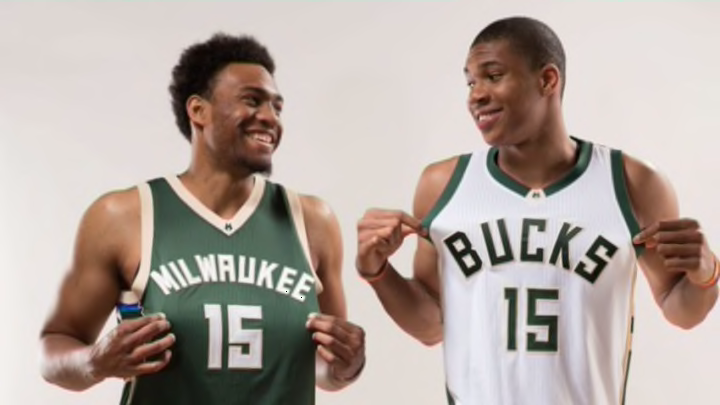
The new jerseys feature a “Cream Rainbow” along the sides as an homage to the “Irish Rainbow” that was on the Bucks’ uniforms from 1977-93. The rainbow consists of the colors cream, green, white, black, and blue. The uniforms are very detail-oriented. The back collar is blue to represent the “blue-collar work ethic” of the city of Milwaukee.
The neckline sports the the alternate “M” logo and there is an upside down “Fear the Deer” slogan embroidered near the waistline.
The home jersey is white with a green outline. The lettering and numbers are green as well. The road jersey is green with a cream trim and the lettering and numbers are cream also. More explanation on the fine details of the design can be found here.

The new uniforms were revealed to those gathered at the Bucks Summer Block Party on June 6 in Milwaukee. Team president Peter Feigin stood atop a building and flipped down a building-sized poster of Jabari and Giannis modeling the new uniforms.
Well. That was just about the coolest thing ever. #OwnTheFuture pic.twitter.com/6WJqhqCk3h
— Dustin Godsey (@dgodz) June 6, 2015
Initial reaction to the jerseys by Bucks fans is positive with most thinking the new owners got it absolutely perfect. Of course there were also people highly critical of the jerseys, but their dislike of the jerseys didn’t seem backed by any real criticism and was only fueled by dislike of the team.
One common comment among the various comment sections I gauged was that the new uniforms look like high school jerseys. All I can say to that is if that’s true, I wish I went to that school because these jerseys are perfect.
Let me know what you think about the new uniforms in the comment section below!!!
Next: Our Latest NBA Mock Draft
More from Hoops Habit
- The 5 most dominant NBA players who never won a championship
- 7 Players the Miami Heat might replace Herro with by the trade deadline
- Meet Cooper Flagg: The best American prospect since LeBron James
- Are the Miami Heat laying the groundwork for their next super team?
- Sophomore Jump: 5 second-year NBA players bound to breakout